
Ben did some nice work with the Penguins–Jets game yesterday, and he put another great idea into my head. Here’s an example:
Minnesota Wild 2011-12 Shot and Goal charts by game
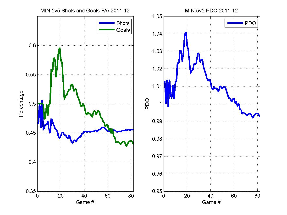
So what do you get here? The first thing is a chart of shot ratio (SF/[SF+SA]) and goal ratio (GF/[GF+GA]):

via behindthenet.ca
In the left chart, shot ratio is shown in blue, while goal ratio is green. Minnesota started out poorly in the shooting department and has been dropping as the season has progressed. Initially they were buffered by a high PDO through about game 20, but they've taken a big dive since then, and they're just barely above 50% in the goal-scoring department. Regular readers will know that I think Minnesota is much more likely to continue diving than they are to bounce back to the high shooting and save percentages they enjoyed for the first quarter of the season; bet against that regression to the mean at your peril.
At any rate, if you're done with the charts, you can click on the "Jump to Game Log" link to see game-by-game 5v5 team level data. This is essentially all of the data behind the chart. Data is there for the last five seasons, with 2011-12 data being updated every day.
